Tuesday, April 10, 2012

Colsubsidio Book Exchange's "Come With A Story"

My first actual post since returning to the blogging world had to be something great.. and I've found it.

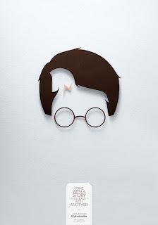
Lowe/SSP3 Colombia recently came out with these lovely ads for the Colsubsidio Book Exchange Campaign. The visual is not only beautiful (with a great use of white space), but it's also a bit of a game for the book-reader within us all.

The idea? Come with a story and leave with another.

The execution? Mix 3 well known book characters with 3 others in paper cut-outs.

See if you can figure out the 2 books that are referenced in each ad. Answers are below the images in white - highlight to see.

 Harry Potter & Troy.

 Little Red Riding Hood & Moby Dick.
Snow White & Sherlock Holmes.


Images via Ads of the World.

Tuesday, March 1, 2011

Superette's Bench Thigh-vertising

DDB New Zealand came up with this hilarious campaign for Superette, in which benches at bus stops, malls, and parks (in areas where the most fashionable girls hang out) contain an indented plate with the words "Short shorts on sale Superette."

Now I'm not sure if the actual imprints on the backs of girls' legs would draw much business, but press and word of mouth just might.

Very creative idea!


Image from Ads of the World

Friday, February 25, 2011

Anaesthesia Lingerie's Animals

So this is not only the second time that I've discussed an Anaesthesia Lingerie campaign by Nikotin, but also the second time their campaign has left me in utter confusion. (Previous campaign here)

Are the ads showing the reactions these animals had to seeing the underwear for the first time? And if so, why on earth are they animals?

Can anyone else shed some light?


Tuesday, February 22, 2011

Dead Island's Trailer

Sitting in my boyfriend's living room last week, I noticed him watching a video that immediately caught my attention.

To my surprise, it was for a video game. Dead Island (for Xbox 360, PlayStation 3, and Microsoft Windows) is a zombie game, with an ad that makes it look like some sort of crazy cool movie (that I would definitely go see). Check out the trailer, it's definitely worth a watch.

Mercedes Benz' Brain

So I've got mixed feelings about these stunning Mercedes Benz ads by Shalmor Avnon Amichay/Y&R Interactive Tel Aviv, Israel.

The ads show a brain, with the left side being a sketch and the right side being colorful and interesting. Each side has a description of what that side of the brain does. Mercedes' logo is on the right side with the tagline "The best or nothing."

These ads are brilliant in appearance with absolutely amazing art direction. They not only immediately caught my attention but I just had to know what they were for.

From an idea perspective, however, I wonder if these ads are really going to help sell a car. While it's an interesting concept, I don't see the Mercedes brand as being extremely creative, and this ad could really be for anything if you just whipped another logo on it.

What do you think?

Click to make images larger


Monday, February 7, 2011

Volkswagen's "Beetle"

So Mini Darth Vader may be going viral, but don't forget about Volkwagen's other great ad of the Super Bowl.

As if Ram Jam's Black Betty wasn't enough of an attention grabber, this ad is visually appealing too. In it, we we see a beetle (as in the bug) racing through his habitat - shocking other bugs with his lightning speed. He finally jumps through to a field of dandelions, and in a smooth transition we see just an outline of a Beetle (this time, as in the car). While watching, try to notice the little details too (e.g. the beetle has racing stripes).

A car commercial without any cars that still excites as if it did have 'em.. fancy that.


Volkswagen's "The Force"

This viral spot by Deutsch USA has been found by Roy Morgan Research to be the consumer favorite of the Super Bowl ads this year.

It certainly is the most adorable.

A mini Darth Vader goes all around his house and just can't seem to find the force. But when Dad comes home, something happens. Or does it?