Showing posts with label Print. Show all posts

Tuesday, April 10, 2012

Colsubsidio Book Exchange's "Come With A Story"

My first actual post since returning to the blogging world had to be something great.. and I've found it.

Lowe/SSP3 Colombia recently came out with these lovely ads for the Colsubsidio Book Exchange Campaign. The visual is not only beautiful (with a great use of white space), but it's also a bit of a game for the book-reader within us all.

The idea? Come with a story and leave with another.

The execution? Mix 3 well known book characters with 3 others in paper cut-outs.

See if you can figure out the 2 books that are referenced in each ad. Answers are below the images in white - highlight to see.

 Harry Potter & Troy.

 Little Red Riding Hood & Moby Dick.

Snow White & Sherlock Holmes.


Images via Ads of the World.

Friday, February 25, 2011

Anaesthesia Lingerie's Animals

So this is not only the second time that I've discussed an Anaesthesia Lingerie campaign by Nikotin, but also the second time their campaign has left me in utter confusion. (Previous campaign here)

Are the ads showing the reactions these animals had to seeing the underwear for the first time? And if so, why on earth are they animals?

Can anyone else shed some light?


Tuesday, February 22, 2011

Mercedes Benz' Brain

So I've got mixed feelings about these stunning Mercedes Benz ads by Shalmor Avnon Amichay/Y&R Interactive Tel Aviv, Israel.

The ads show a brain, with the left side being a sketch and the right side being colorful and interesting. Each side has a description of what that side of the brain does. Mercedes' logo is on the right side with the tagline "The best or nothing."

These ads are brilliant in appearance with absolutely amazing art direction. They not only immediately caught my attention but I just had to know what they were for.

From an idea perspective, however, I wonder if these ads are really going to help sell a car. While it's an interesting concept, I don't see the Mercedes brand as being extremely creative, and this ad could really be for anything if you just whipped another logo on it.

What do you think?

Click to make images larger


Tuesday, January 11, 2011

Mini Hearing Aid's "Said ___, Heard ___"

So this is a pretty cute campaign idea by Monday in Bangkok for Mini's hearing aids.

The first features a duck, then all the things the word duck could be confused with. The second is the same but with a dog. The headlines are "Said 'duck.' Heard 'duck.'" and "Said 'dog.' Heard 'dog.'"

It's kind of fun to figure out what each picture is. Good concept and interesting art direction. Click to see them larger.


Photos via Ads of the World

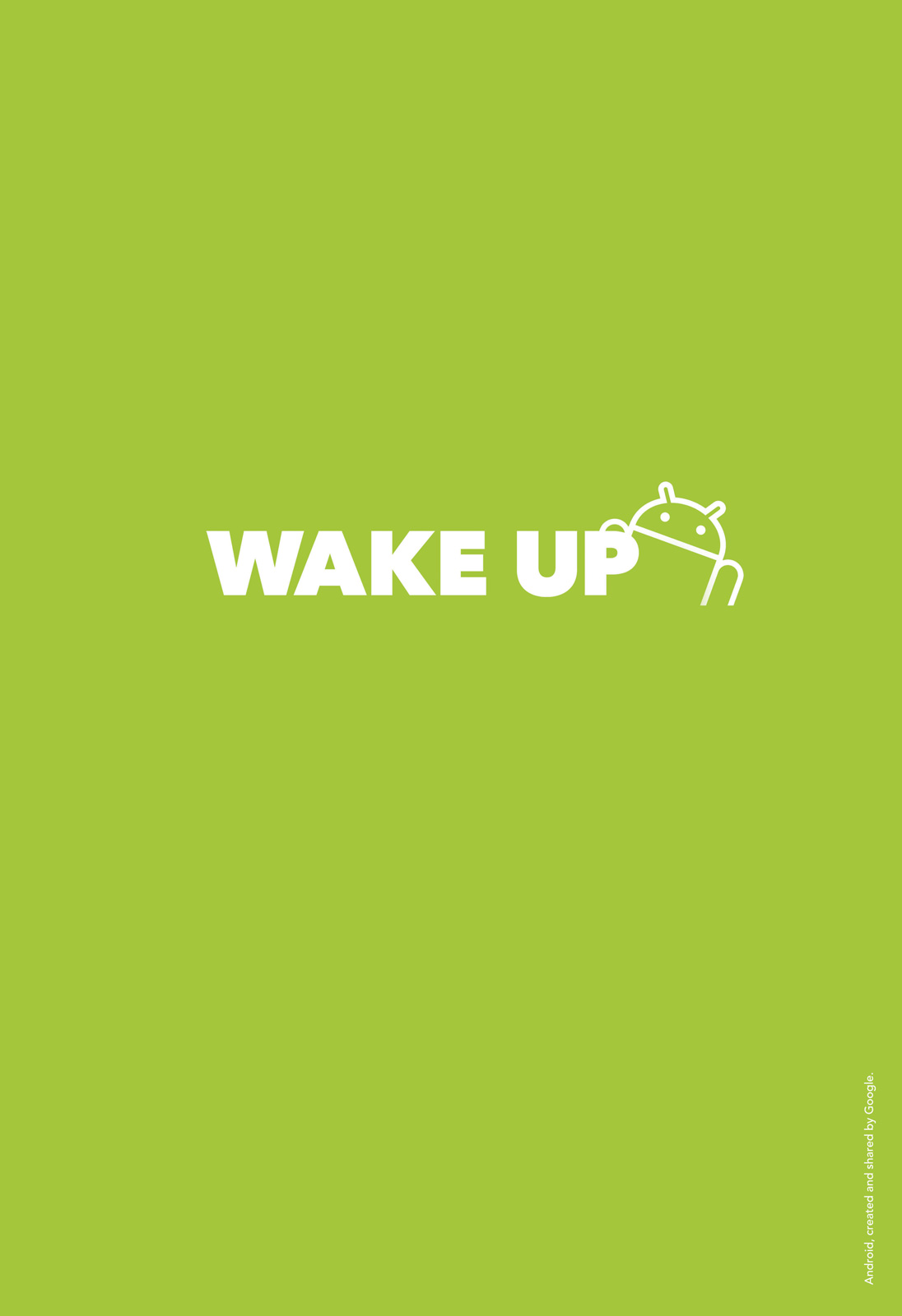
Android's "Wake Up"

Hey iPhone users. 

Remember on January 1st and 2nd when the iPhone alarm glitched? Your alarm didn't go off, you were late, and it sucked?

Well Android has a print ad response to that, done by McCann Istanbul.


I adore the simplicity of this ad. And it's pretty clear who it's targeted to. "Wake up. Android. Created and shared by Google."

Friday, September 10, 2010

Anaesthesia Lingerie Print Campaign

Sometimes I look at an ad and all I can see is clutter... a large colorful image with too much text that just makes you want to look away.

Well these ads by Nikotin for Anaesthesia Lingerie [sic] are the exact opposite of that.

At first glance, the ads started off strongly for me. The gorgeous simplicity of a simple black image in between quotation marks on a white background definitely caught my attention. But they quickly lose their appeal. The only other thing on these ads is the company's logo. Well what are they supposed to mean? What on earth do a lightning bolt, water drops, and exclamation marks have to do with wearing pretty undies? This campaign is a perfect example of when more is better. Perhaps a simple paragraph of body copy could have helped Anaesthesia make their point.

What do you think?


(Photos via Ads of the World)

Monday, September 6, 2010

Fiat GPS's Flags

I'm starting this off by saying this: I love this campaign.

Marcel (of Paris) created these 6 print ads for Fiat informing consumers that updated GPS maps are available on their website.

Rather than doing a cliche picture of a map as one might expect, these ads show funky colors and patterns. Seems a little unrelated right? Wrong. When you look at the bottom right corner of the ad, you notice a GPS system showing countries' flags. Turns out these patterns are super zoomed in images of the flags. "Find your way everywhere in the world" the ad says.

Really cool idea and they did a great job rendering it. Two thumbs up.

Wales:


Lebanon:

India:

Ecuador:

Canada:

South Korea:

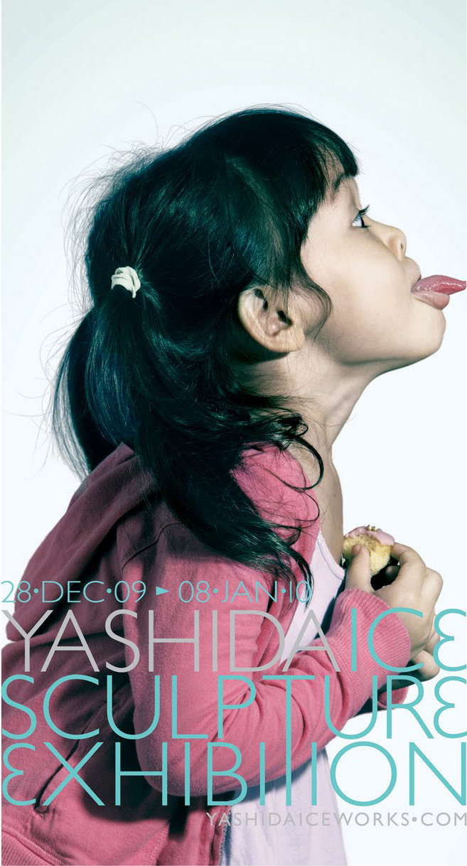
Yashida Ice Sculpture Exhibition's Tongue

I can definitely say that this print campaign put a little smile on my face.

Publicis Singapore put together these 3 ads for the Yashida Ice Sculpture Exhibition back in December. It reminds me of that famous scene in Dumb and Dumber where Harry licks the ski post (here).

Simple, funny, nice type, well done.


Tuesday, August 24, 2010

Fiat Linea's SMS Voice Reader

As all of us have hopefully heard: texting while driving is the cause of many car accidents.

Well this new campaign by Leo Burnett Brazil is for a product that stops texting while driving: the new Fiat Linea with SMS voice reader. This print campaign (comprised of 4 ads) shows text messages imprinted on a truck, a tree, a pillar, and a cow: all things that those who text while they drive may end up crashing into.

Imagine how much fun receiving sexts from that special someone would be over this device.


(Click to enlarge)


Photos via Ads of the World

Thursday, August 5, 2010

Arçelik Wide Refrigerator

Arçelik's new campaign by Young and Rubicam Reklamevi is very creative... considering they're advertising a fridge.

Two print ads show one fruit or vegetable composed of a bunch of another type of fruit or vegetable (a raspberry made of tomatoes and a grape bunch made of watermelons). What's the point? That fridge is damn wide. 84 centimetres in fact.

Nicely executed.

(Click to enlarge)

Thursday, July 29, 2010

Dreft's "Fashion always returns"

The great thing about Leo Burnett Brazil's latest print campaign for Dreft Laundry Detergent, is that it's so true.

These new ads show an old personal picture (circa 1970) on the left side, and a new fashion-magazine type picture on the right side. A piece of clothing is common between the two, and the headline reads "Fashion always returns. Take care of your clothes."

Coming from a fashionable mother, it resonates. (Hi mom, I know you're reading this.)


(Photos via Ads of the World)

Elaine's Bagels' "One of many flavourful bagels"

Elaine's Bagels (which through a quick Google search appears to be located in Michigan) has a new print campaign done by agency Squid Inc.

Three different ads feature a bagel in the center of a solid background. The bagels are not regular bagels, however, but instead they resemble their flavors (the onion flavored looks like an onion, the cheese flavored looks like cheese, and the blueberry flavored looks like a blueberry). The line below says "(insert flavor here). One of many flavourful bagels."

Sometimes simplicity works. And I really think it did in this case.


(Photos via Ads of the World)

Saturday, April 17, 2010

Ritual Magazine's "Dark Kids"

I tend to always blog about videos, let's get a few print ads into the mix.

Ritual Magazine is "the first Italian magazine of dark, gothic, electro, industrial music and culture." And, boy, their ads sure fit the description. These four prints by Ogilvy Italy feature "dark kids," and they're creepy in a Tim Burton kind of way (as in still lovable). I'm absolutely crazy about them.

One features a little boy (a mini Dracula) who "waketh up at midnight" (this one is by far my favorite, the kid is PERFECT for it). The second is the adorable Morgana who "had no friends" so she plays with rats. Finally the third (and perhaps the creepiest) is Melissa holding hands with ghost Mircalla as the two "never had the chance of being sisters."

(Click for full size)


Pictures via Ads Of the World

Thursday, March 11, 2010

Durex's Type Ads

So I'm not quite sure what the deal is with these ads. Every source I've found simply says "by Andrej Krahne" without mention of an agency. With a little further research I discovered that Krahne is a German illustrator and designer, so are these simply Krahne playing around or are they really for Durex? Either way, I can't particularly say that I like them. This campaign consists of 3 print ads made entirely of typefaces. All 3 feature a man and a woman in different sexual positions created out of words, with the Durex logo where the man's junk is.

In the first, the woman is seated on a table (created out of the word "wood") and the man is standing. He is created mostly out of "overload" while she is created out of words like "heaven," "peace," and "paradise."

In the second, the man is in the crabwalk position with the woman on top. He's mostly "muscle tension" while she is "quaking," "horny," "orgasm wave," "vibrations," and for some reason "confused."

In the final one, the woman is giving the man oral pleasure. While he's mostly "Fatal error," she's "tasty," "contented," "fruits," "satisfied," "happy," etc.

I'm sorry, but I'm confused. I thought men enjoyed sex as well? Durex may have the whole controversial-we're-gonna-get-talked-about thing going on if these ads are real, but I still don't like the campaign.


Saturday, February 20, 2010

Heinz Mayonnaise "Spaghetti"

This amazing Heinz mayonnaise ad is the genius work of Leo Burnett in Brussels. Seriously, I love it. This print ad was first seen in June 2007 in Belgium. It features a plate of spaghetti..... But is it really spaghetti? Hint: "Heinz Mayonnaise: Now in a squeeze bottle."

Apparently I'm not the only one who loves this. It won a Bronze Lion in the 2007 Cannes Festival.

I know I know.. I'm 2 and a half years late on this one. But oldies can be goodies.

Thursday, January 14, 2010

Ford "Do Knot Forget"

Ogilvy Germany came out with a new print ad for Ford that seems a little absurd at first. It showcases fifteen different knots made by iPod earphones (and I'm sure we've all found our earphones brutally tied up at some point. My favorite is the Sheetbend Double).

So what does this have to do with Ford cars? The headline explains. "Do knot forget. Bluetooth comes with every new Ford." Meaning? You won't have to use those pesky earbuds again.


Monday, December 21, 2009

Bose SoundDock

DM9JaymeSyfu (yes, that's an agency name) has created a couple of interesting print Bose ads. At first glance, they're nothing special. Just an iPod on a dock centered in the middle of nothingness. "Hear More. SoundDock." is in the bottom right hand corner. I figured it was a little too simple - there had to be something more. When trying to analyze it, my first thought was - is the white space being used as a metaphor for the "more" that you're hearing? I then clicked on the original sized ad, and realized what was going on. While the white space may very well be a metaphor, the key element of the ad is only visible in its large size.

Well, I'll let you see for yourself:


They're a little boring, but I kind of like the simplicity.